Fix Blurry Pixel Art Style Fonts in Unity
September 27, 2016
The Unity UI system is great, but by default it doesn’t tend to work well when using fonts that require very sharp edges like those seen in pixel art style games. Though the fonts look alright, upon closer inspection the edges of the characters are slightly blurry and sometimes the characters look off. In the image below, if you look closely, you can see some blurriness around the character edges.
Switching the font’s import setting Rendering Mode to Hinted Raster can help a bit with the blurriness, but it doesn’t seem to reproduce the characters properly. This leads to letters that look slightly different than they do in the original font.
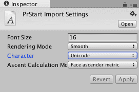
Luckily there’s a way to fix this issue in the Unity editor that doesn’t require too much additional work. Begin by bringing a font into your project like you normally would. For this example I’m using a font called Press Start. Next click on your font in the project window to open the inspector, change the Character dropdown to Unicode, and click Apply. This process prepares Unity for the next step.
Click on the cog in the top right of the font inspector, and select Create Editable Copy. In your project window you should now see a new material, texture, and font asset with similar names to your existing font. By default when Unity imports a font it doesn’t give you the ability to modify the related material and texture. Create Editable Copy gives you these assets to modify to your heart’s content.
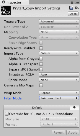
Now click on the newly created texture, which should open the texture inspector. Switch Texture Type to advanced and change the Filter Mode from Bilinear to Point. This should remove the blurriness from your font’s texture. The settings I’ve used are in the image below. Sometimes it seems as though selecting the incorrect settings can cause issues when displaying your font, so if you are having issues just start the process over and try to match the settings below.
Now click on your UI Text object in the hierarchy, and replace the existing font with the new font asset (PrStart_copy in my case). You should immediately see sharper text in your game view. The image below shows the old font on the top, and the new font on the bottom. Hopefully it’s clear enough to illustrate the difference the above steps make.
The UI system, and text in particular, can be quirky in Unity. Though like most things, the options are there to modify assets to get the look you set out to create. If you have any further questions please feel free to message me on Twitter @RyanNielson or comment below.


